01Feature launch in a legacy system
A tracker for non-linear repairs
Demo
Interactive replica built in Storybook with Claude.
Repair status in Decisiv's Case was manually updated, rarely accurate, and buried below the fold, leaving service advisors piecing together updates from notes and audit logs every time a customer called. Accurate status also fed a repair history that travels with the truck across ownership changes, so the stakes extended well beyond any single repair interaction.
As the lead designer working with a PM, researcher, tech lead, and subject matter experts, I explored three tracker directions, defined a five-stage model by narrowing 25 existing statuses with a researcher and stakeholder group, designed the tracker from wireframes through high-fidelity UI, and shipped the status tag and a cleaned-up case header alongside it.
The step tracker had been on everyone's wish list for years: what had kept it from shipping was the constraint I found most interesting, mapping a clean visual model to existing repair data without touching the underlying status logic.
Some details in this case study have been omitted to protect confidential information under an NDA. The scope and impact of the work are accurately represented.
Impact at a Glance
25→5
25 statuses consolidated into 5 comprehensible stages
76%
Of statuses mapped cleanly to one of the five stages
Usage ↗
In the first month:
+6.2% Diagnosing
+2.7% Approved
+2.6% Working
Tag Component
Status tag adopted across the product before the tracker shipped
The Case Timeline feature Carla designed was a first for the North American heavy truck service industry. It positioned Decisiv as the source of truth for repair status between trucking fleets and their service providers.
Discovery
I needed to understand how repairs actually progressed and how advisors were using the status system in practice.
Real repair workflows are messy
Subject matter expert interviews, journey mapping, and prior research confirmed that repairs are non-linear. A truck might skip diagnosis entirely. A technician might get approval, start work, discover additional problems, and need a second approval before continuing. All repair statuses stay available at all times, with no dependencies between them. Any tracker had to handle that without breaking.
A System Too Entrenched to Change
Pendo analytics and internal usage reports confirmed that most of the 25 statuses were rarely used, with a small cluster carrying nearly all the traffic. I asked why not retire them. The answer: they’d been added over time at individual clients’ requests, and the migration alone would have been a project in itself. The solution had to work on top of the existing system, not restructure it.
Exploring Directions
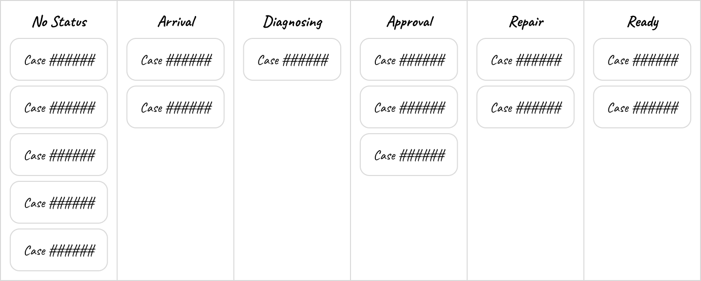
The step tracker was always the expected direction: simple, consistent, and familiar. But before committing, I explored two alternatives. The first was a chronological view showing repair status history alongside upcoming events like follow-up time and estimated completion. The second moved progress tracking to the home page, grouping cases by repair stage instead of burying it inside individual case pages.
The timeline was too complex. The kanban view was compelling, but it meant significant development work and a fundamental shift in how users navigate the product. The tracker won.


From 25 Statuses to 5 Stages
The tracker depended on repairs sharing a common enough lifecycle to be shown as fixed steps. The 25 statuses were too granular for that, but each one could map to a stage, advancing the tracker automatically with no new behavior required from service advisors.
Card Sort
We ran an internal card sort with five people who had deep operational knowledge across different dealers. All arrived at seven categories or fewer, with strong agreement on the core stages. The main disagreement was around parts-related statuses. Some statuses couldn’t be placed in any category at all.
Five Stages, 76% Coverage
I combined card sort results with usage data, then led brainstorming sessions, first with the design team and then with the PM, landing on five stages. We explored several naming systems before settling on Arrival, Diagnosis, Approval, Repair, and Ready. 76% of repair statuses mapped cleanly to one of them. The remaining 24% were treated as flexible: pauses, holds, and transitions that update the case record without advancing the tracker.
We validated the stages externally with an unmoderated card sort in Maze. 136 participants agreed with the groupings. The only exception was Hold (Parts), where opinions split depending on location processes.
Defining the Tracker Structure
Equal or Proportional Spacing?
I evaluated two spacing approaches: equal weight per step, or proportional to average stage duration. Equal spacing held up better, since proportional widths varied too dramatically across different repair scenarios.


Skipped Stages
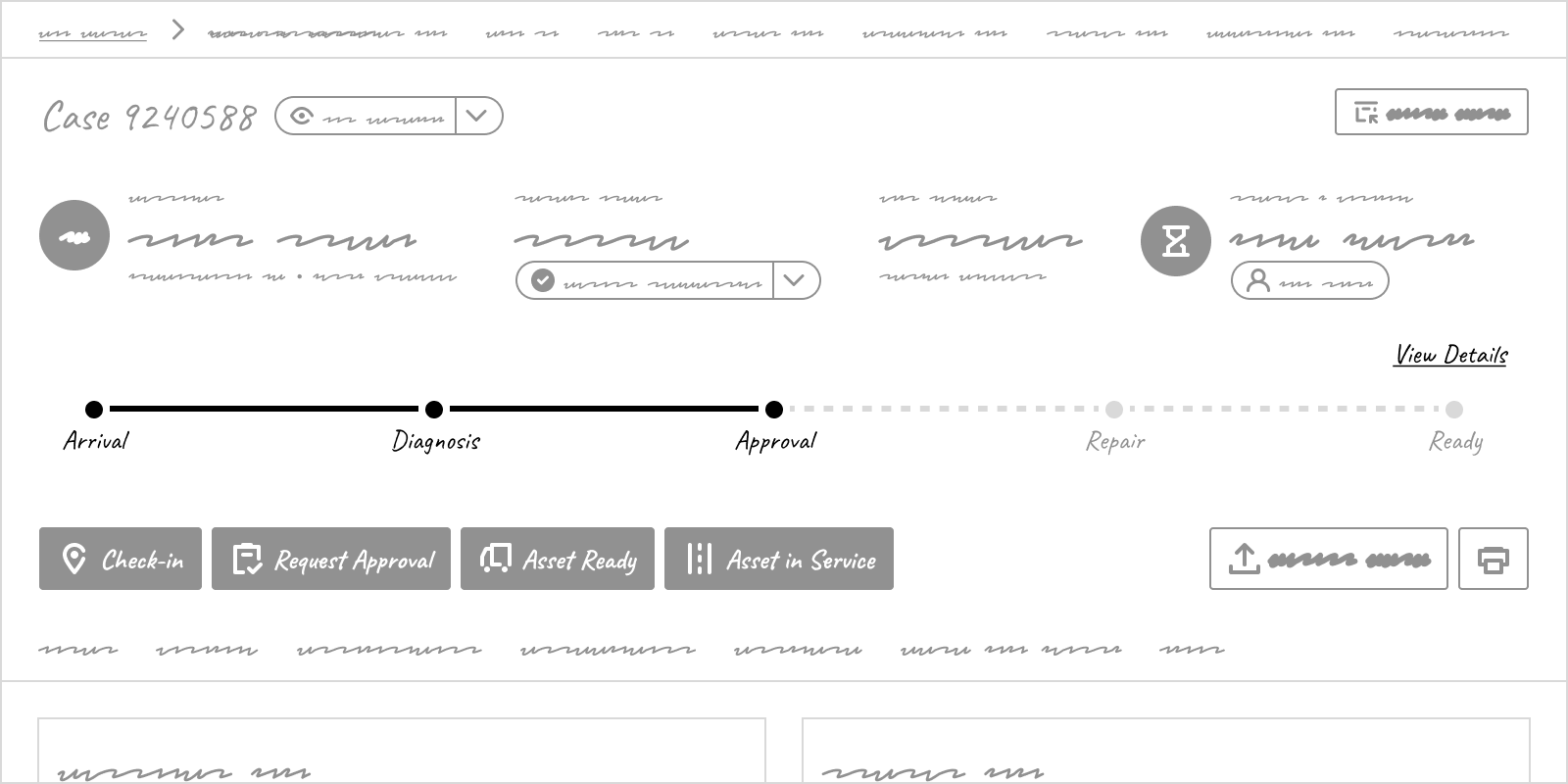
If a stage has no statuses applied to it, it appears dashed, signaling it was skipped.

Revert or Repeat Stages?
When a status from an earlier stage is applied, the tracker could revert to that step (collapsing what came after) or repeat it (appending the stage again). Reverting was simpler but would hide what actually happened. Subject matter experts advised repeating it, so I accepted an unpredictable number of steps to preserve the real repair history.


How Much Detail to Surface?
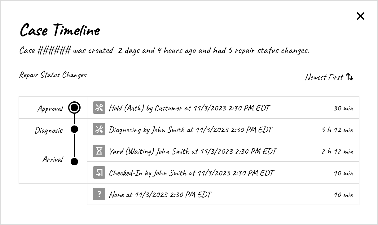
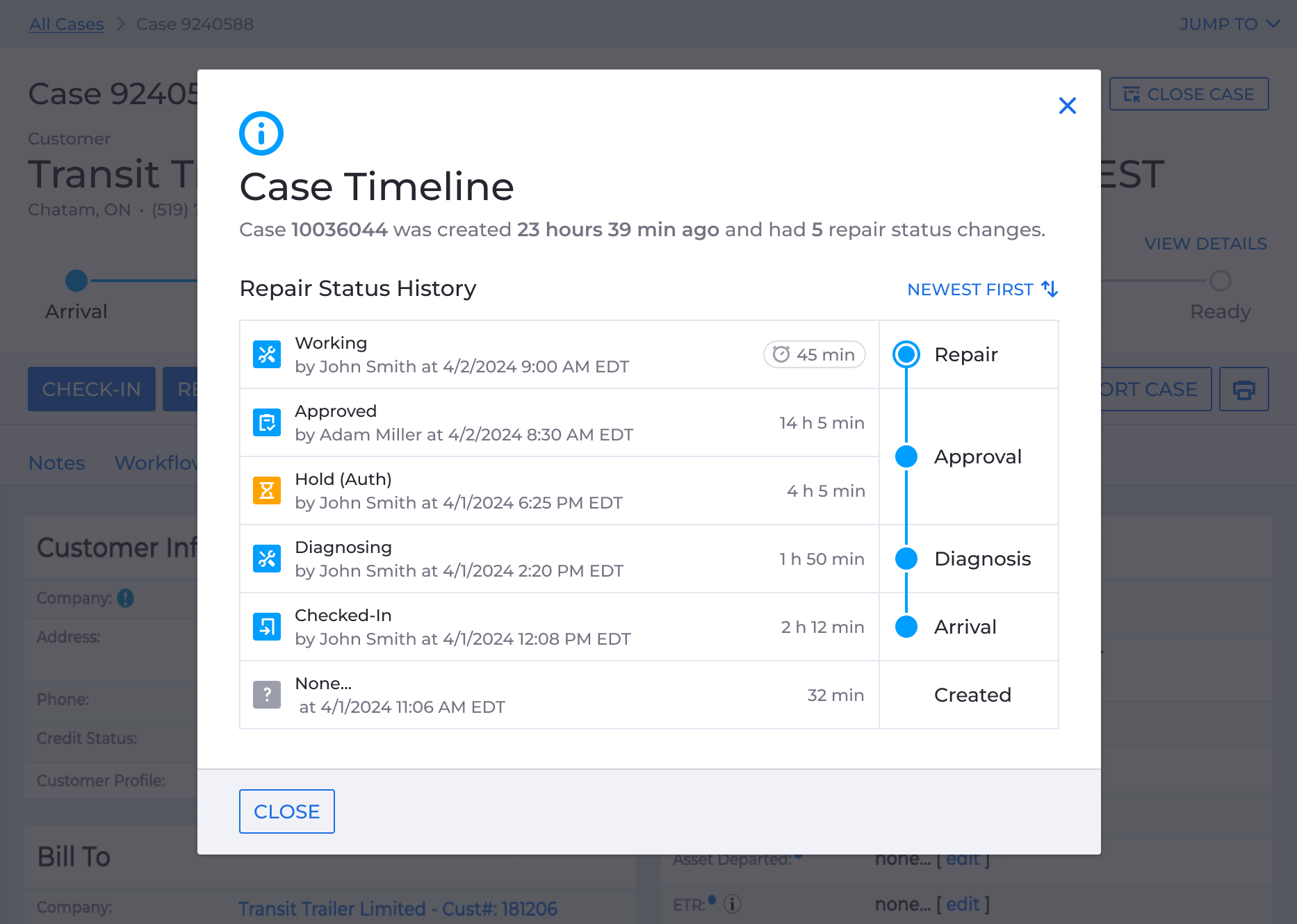
I explored three levels of detail: a lightweight status tag beneath the active step, an inline expansion per step showing status history and timestamps, and a View Details modal with the full repair history. The team agreed on the modal so advisors could read the full story of a case without navigating away.



Where Should the Tracker Live?
The tracker had to be above the fold, which pointed to the case header. I started below the quick action buttons to keep the layout intact. But the buttons trigger status changes that advance the tracker, so placing it above them made more sense: advisors could see where the repair stood before acting. I also considered the Status Info panel, but panels expand progressively and the tracker would likely have ended up below the fold.

The Design
I explored several visual directions (dots, stage icons, background bands) and landed on the simplest treatment. The tracker was going into a crowded header; anything heavier would compete with what was already there.
Repair statuses already had a color classification (blue for informational, yellow for on-hold, green for approved or finished, red for declined). I carried that directly into the step bubble.
Status colors carried into the tracker: blue for in-progress, orange for on-hold, red for declined, green for complete.
Restructuring the Case Header
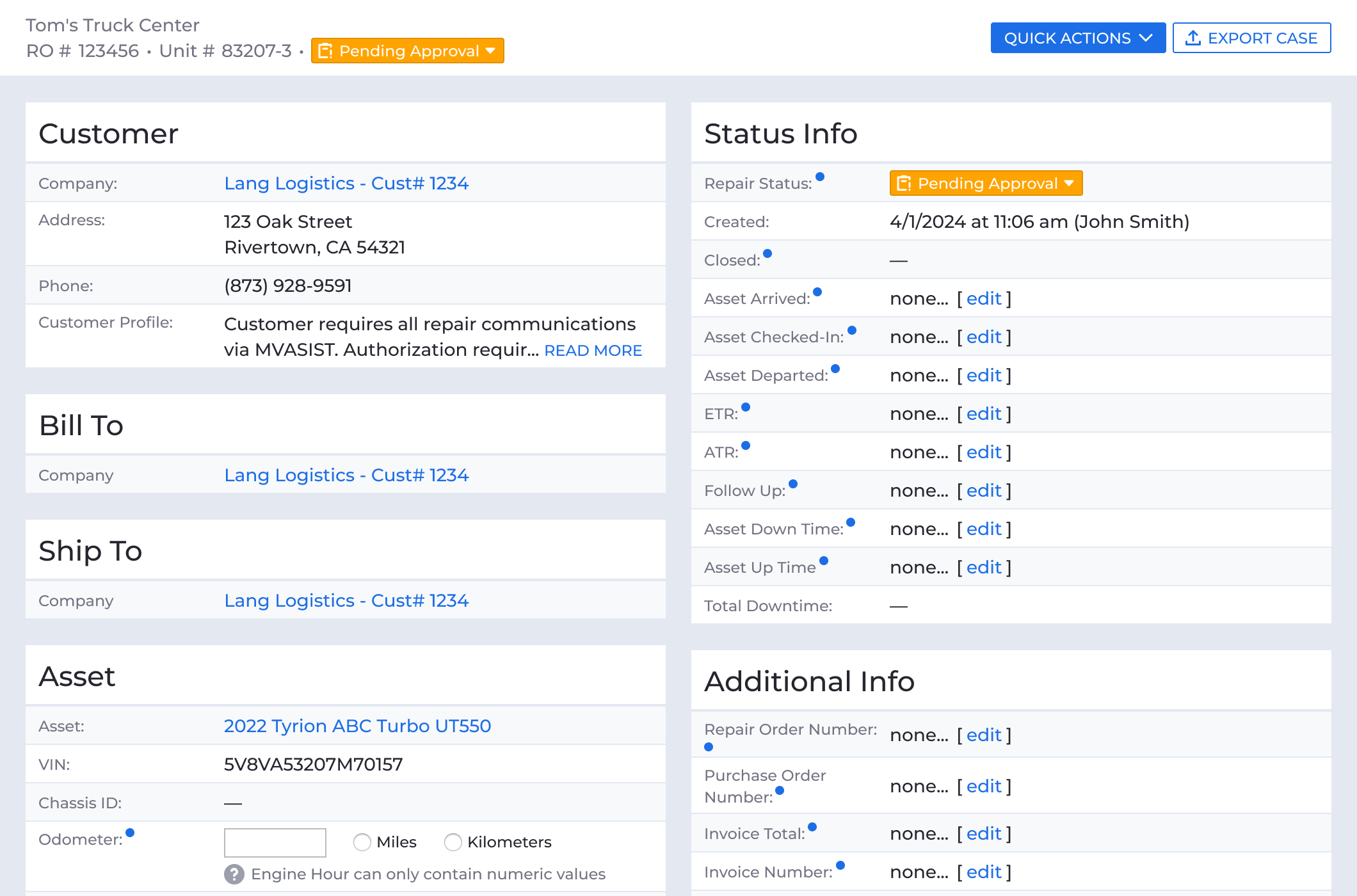
Making room for the tracker meant reducing visual weight across the header. The quick action buttons lost their icons, section links dropped their radio circles and uppercase treatment, and seven jump links collapsed into a single menu.
I tried a few ways to create separation in an already busy header, but kept the change as small as possible: giving the quick actions a background of their own was the cheapest way to group them without touching much else. Banding them together reads as one set of controls and separates them from the case details and the tracker above. Every control stayed available, but with less competing for attention, the tracker reads first.
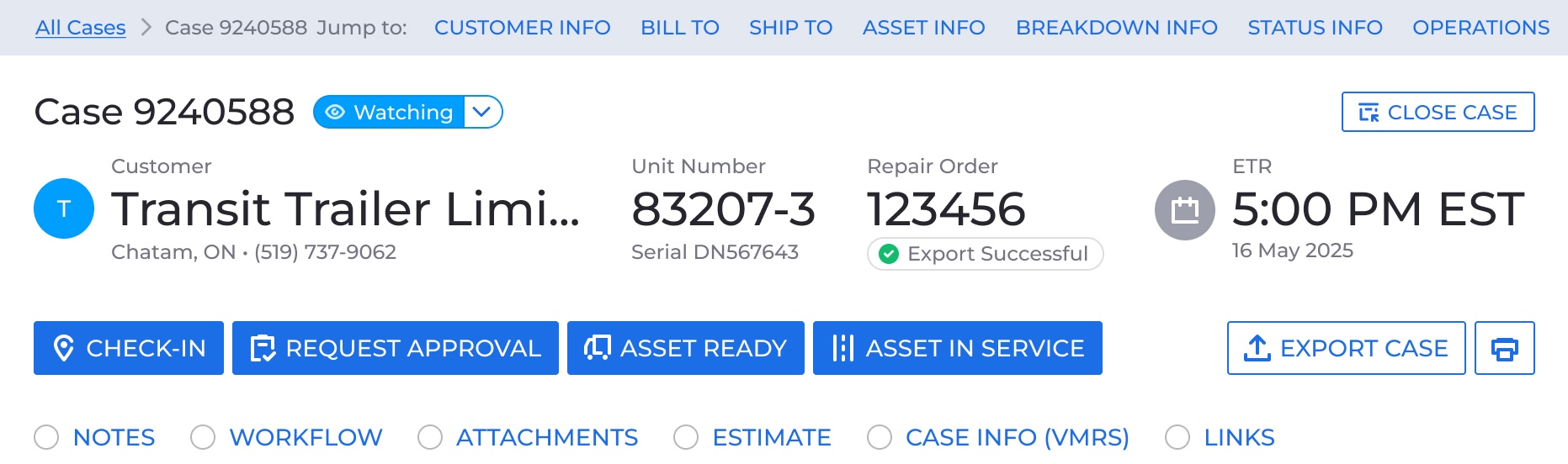
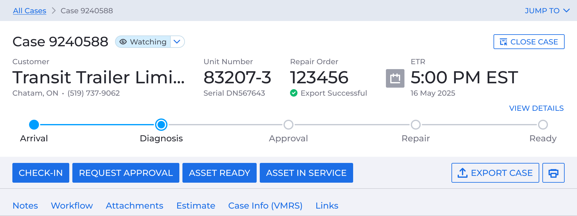
Restructuring the header put the quick action buttons next to the statuses they set, and the mismatch between them became impossible to ignore.
Surfacing a Naming Problem
There were four quick action buttons: Check-In, Request Approval, Asset Ready, and Asset in Service. Each triggered a specific repair status on submission, but the button names and the statuses they set didn’t always match, making the connection harder to follow.
Aligning the labels was the obvious fix, but renaming statuses or buttons was a platform-level change that deserved its own process. I left the existing names in place for the usability study and started making the case separately.
The Status History Modal
The modal was built using the KeyDS, Decisiv’s shared component library. That meant the UI came together quickly and stayed consistent with the rest of the product.
Validating the Design
I collaborated with a researcher and built clickable prototypes in Figma to test the design. We ran moderated interviews with five service advisors and a foreman across four dealer locations.
Participants identified the tracker quickly, understood its purpose, and followed skipped and repeated stages without trouble. They were confused about which color indicated an active stage, overlooked the View Details button and found the modal information unclear. Participants who didn’t typically update repair statuses couldn’t tell what was controlling the tracker.
We decided to retire the View Details button and modal. I addressed both the color confusion and the question of what was powering the tracker by adding a repair status tag directly on the active stage.
"If you needed to quickly answer a question to a supervisor or to a customer, you can say, you know, we got the approval, we're actively working on it right now."
Renaming the Statuses
After the study, I used the opportunity to also tackle the naming problem identified earlier.
I proposed the following name changes: Hold (Auth) became Pending Approval, Complete (Here) became Asset Ready, and the Asset in Service button and the Complete (Gone) status took a single new name: Checked-Out.
I collaborated with a researcher on a second study and built clickable prototypes in Figma to test the new names. We ran an unmoderated study with service providers and received 84 responses. The term “Checked-Out” was ambiguous, and users interpreted it differently. But one participant suggested Released to Customer, and we adopted Asset Released.
I worked with the PM to launch the platform copy updates before the tracker so users absorbed this round of changes first.
Designing a Reusable Repair Status Tag and Panel
The color confusion and hidden logic uncovered in testing shaped this next step. I designed a reusable repair status tag to work anywhere the case needed to surface its status, not just on the active stage.
The Tag Design
I designed a compact tag to fit within the tracker without competing with the surrounding header. Each tag uses the colors and icons previously established by Decisiv for the repair status. Fleet users get a read-only version; service providers get an interactive version with a caret, and can tap it to open the status update panel.
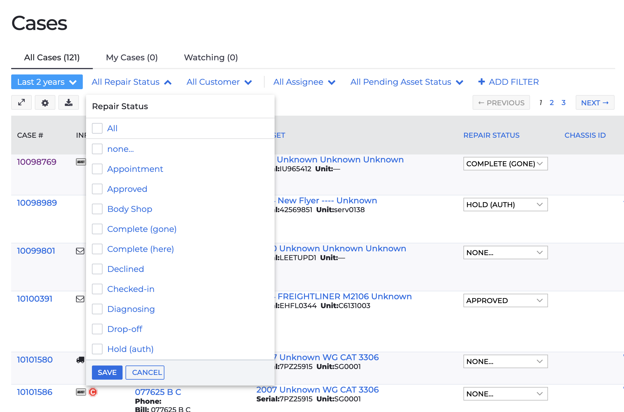
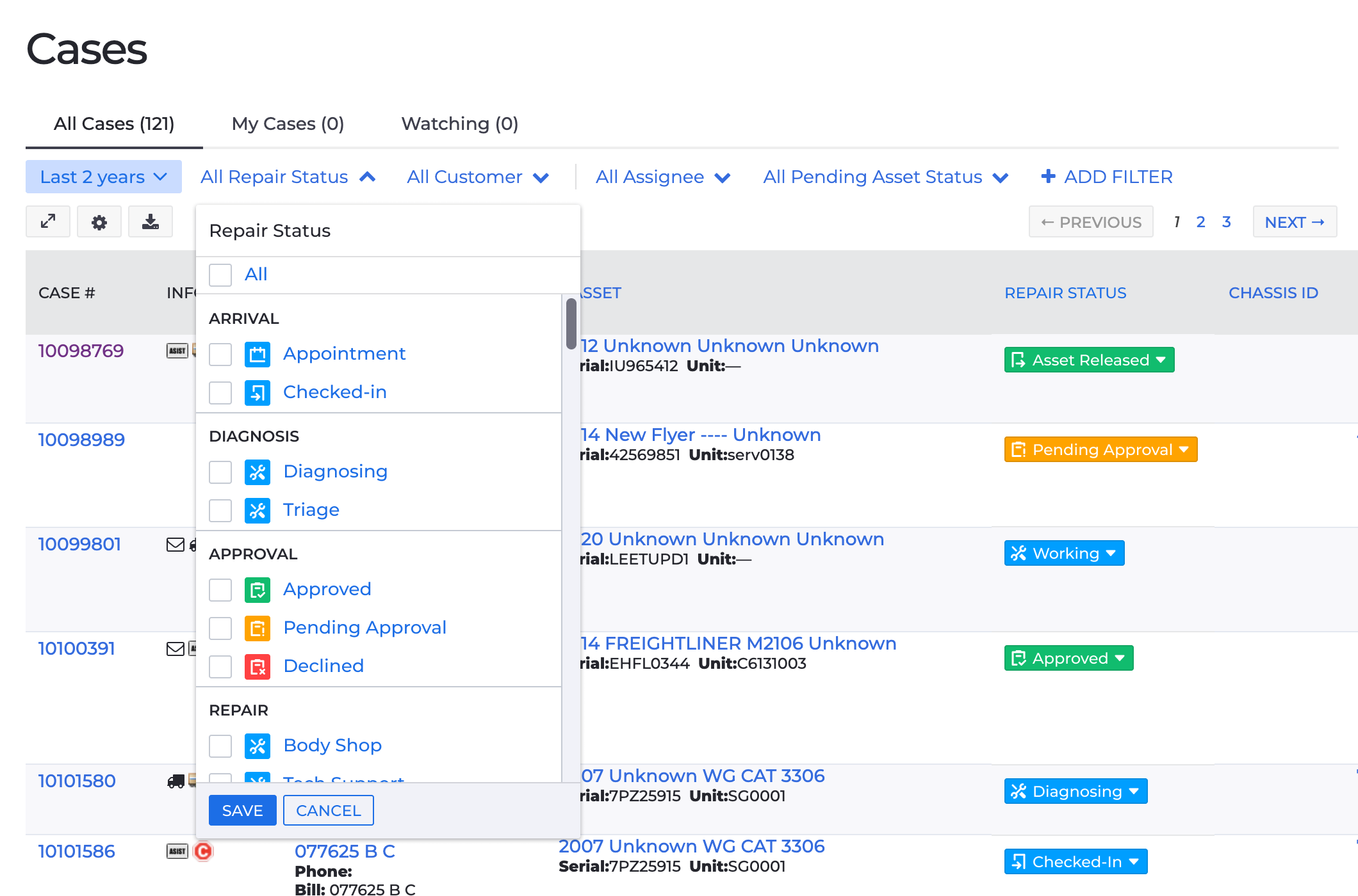
Updated status tags grouped by stage, using Decisiv's existing color and icon classification.
The Status Panel
The new panel was built with the KeyDS and groups statuses by stage, each option paired with its visual tag.
We tested the reordered list in the same unmoderated study that tested the name changes. Participants found what they needed, and no one left a negative comment about the new order.
The final panel also gained typeahead search for users who knew what they wanted but didn’t want to scroll through the list. We also wired up the statuses associated with quick actions, marked with ···, to open the same form as the button rather than applying immediately. It adds a step, but it’s a deliberate tradeoff to enforce best practices.
The Status Tag and Panel Launched
The tag launched ahead of the tracker as a reusable component across the product. The all-cases table, the Status Info panel, and the quick action modals were all updated to display it first, so users were already familiar with the visual language before the tracker shipped.
Before
After
Before

After
Tracker: Final Design
With the tag designed and validated, the only thing left was integrating it into the tracker. I tested displaying it above and below the active stage, and decided on above to reduce conflicts with existing content in the header. I also made the tracker’s state easier to read at a glance by turning past stages green with a checkmark inside the bubble. Here’s how the read-only tracker looked:
Happy path
Pending Approval (yellow) and Declined (red) at the Approval stage
Skipped stage
Repeated steps, the tracker appends rather than rewinds
In context, integrated into the case header:

Impact
The tracker launched in June 2025 for both service providers and fleets. First-month data showed the right indicators moving: Diagnosing up 6.2%, Approved up 2.7%, Working up 2.6%. Complete (Gone) was the only status that dropped (down 2.2%), likely because users were still adjusting to its new name, Asset Released. NPS trended upward in the same period.
The tracker wasn’t the only thing that shipped. Copy changes across the platform, a renamed status vocabulary, and a reusable status tag all landed before the tracker itself. We rolled them out first so users had time to adjust before the next change arrived. By the time the tracker shipped, it landed on visual language they’d already seen.
Looking back
While I’m proud of the level of simplification we achieved, I wish I’d spent more time on the 24% of statuses we couldn’t map to a stage. Most had been added over time at individual client requests, which means at least some of them represented real workflows for a small group of users we never talked to. A short round of interviews with those users might have revealed where those statuses actually fit, and potentially changed how we thought about what belonged in the “other” bucket.
Other Case Studies