02Funnel optimization
Fixing a leaking job application flow
Quick Apply, Talent.com's on-platform application flow, was losing real job seekers to drop-off while a large share of completions were bot traffic.
As the lead designer working with a PM, developer, and data engineer, we identified three leak points through a UX audit and funnel instrumentation, and I designed targeted fixes for each and built prototypes to validate them before implementation.
I was convinced the drop-off was a design problem as much as a product or technical one. Defining the fixes, testing them, and watching that hypothesis hold up in the numbers was what made it engaging.
Some details in this case study have been omitted to protect confidential information under an NDA. The scope and impact of the work are accurately represented.
Impact at a Glance
7.7→11%
Overall conversion
+30%
Completed applications
+11%
Basic Details completion
75→92%
Review step completion
A particularly strong aspect of our collaboration was Carla's ability to communicate design intent. Understanding the reasoning behind her decisions helped me make better technical tradeoffs.
Discovery: Understanding Where the Experience Was Failing
Quick Apply involved several steps, each a potential drop-off point.
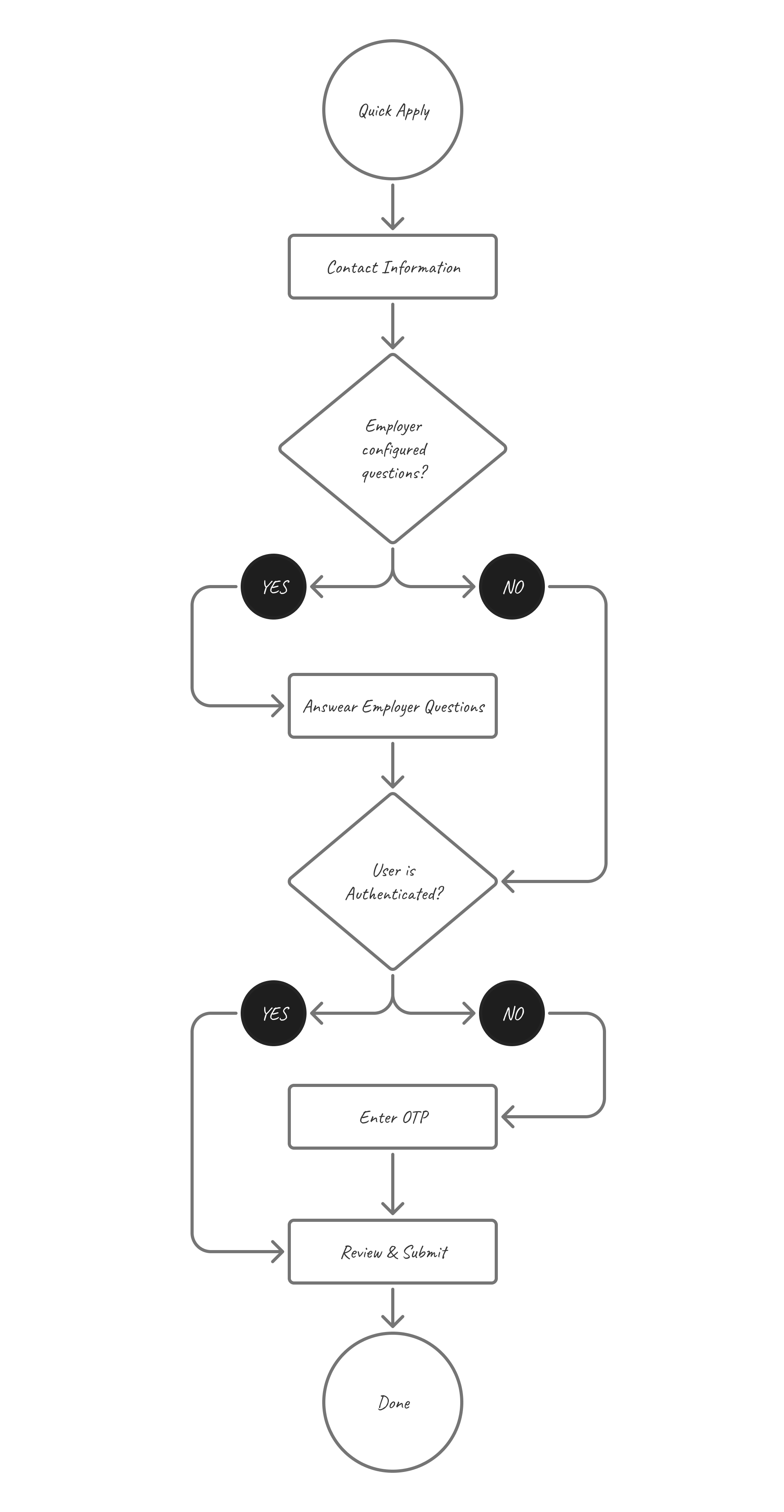
Auditing the flow exposed friction at nearly every step
I audited the end-to-end experience for authenticated and unauthenticated users across mobile and desktop. The problems compounded across the flow: users couldn’t easily tell what was required or how many steps remained. The system was failing to prefill information it already knew, asking users to repeat work. The prefill fix alone increased basic details completion by 11%. Mid-flow authentication broke momentum at the point of highest intent. And localization errors, OTP delays, and broken verification states interrupted progress throughout.

Incomplete tracking was hiding the real drop-offs
Once tracking was in place, we identified three major leak points, each pointing to a different kind of failure and requiring a different response:
- A majority drop during the first step (contact information), most likely a structural acquisition problem. The majority of Talent’s users don’t browse jobs on the platform directly. They encounter a listing on another job board, click through expecting to land on a company career page, and find themselves on Talent’s interface mid-application instead. For many, it’s their first encounter with the product. The drop was real, but the cause wasn’t something a UX change could fix. We noted it and moved on.
- A significant drop during OTP verification: friction affecting motivated users who had already started applying, driven by a combination of technical issues and confusing verification UX
- A smaller but costly drop in the Review step: late-stage abandonment after users had already invested effort, with mobile users disproportionately affected at the final step
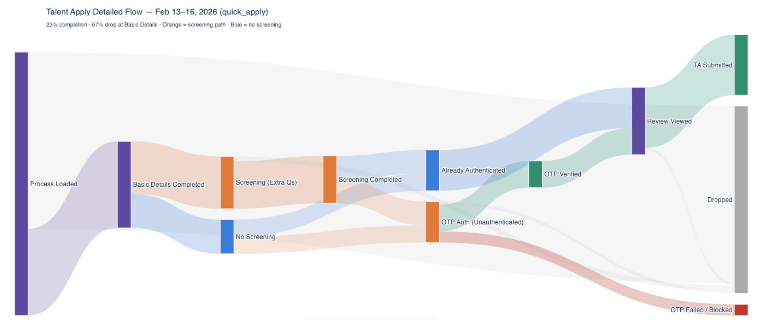
But running parallel to the funnel work was a separate investigation into bot abuse. When the scale of it became clear, it reordered priorities. A large share of applications were bot-driven, which meant the funnel data itself wasn’t trustworthy. Authentication moved to the top of the list: it was the most urgent lever to stop the abuse and the only way to get clean signal on what real users were actually doing.
Redesigning the Entry and Verification Flow
Without a sign-in prompt at entry, the problems compounded in ways the funnel didn’t fully capture. New users (30%) landed mid-application on a platform they’d never used. Returning users who weren’t signed in risked creating duplicate accounts. And Google SSO users who entered their Gmail triggered OTP instead of their Google login, potentially splitting their application history in two.
The case for a login gate
No one likes a login gate. But authentication at entry was the most defensible path to filter abuse and reliably prefill information for any returning user. It’s also industry standard for most application flows, which gave us confidence in the tradeoff. The move introduced a small, expected dip in overall conversion.

Bringing the login form into the flow
I brought the existing Talent.com login form into the flow, unlocking Google SSO for Quick Apply for the first time. I updated the title and description to feel specific to the application, and disabled the Continue button until a valid email was entered to nudge users toward Google SSO.
Before
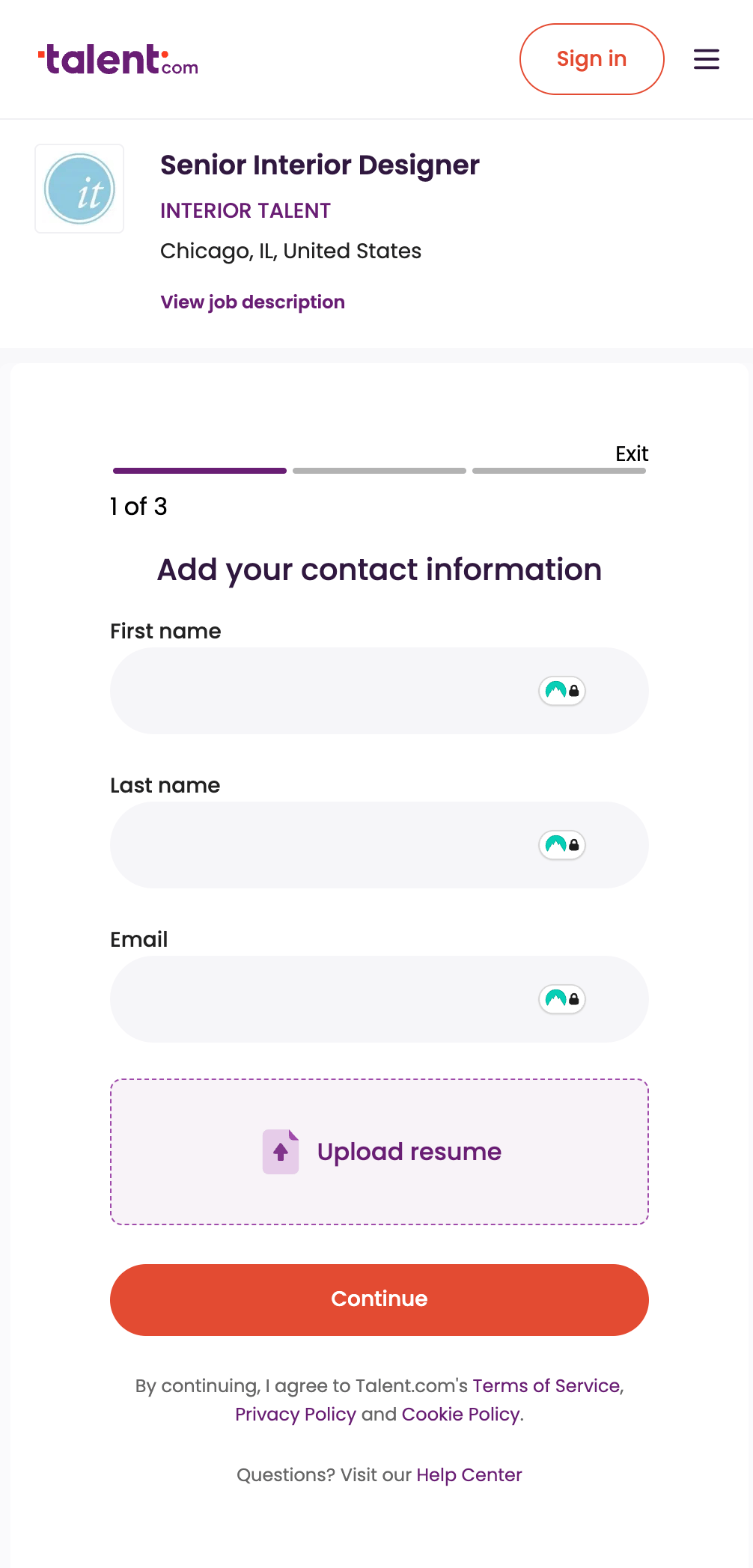
After

Making OTP easier to recover from
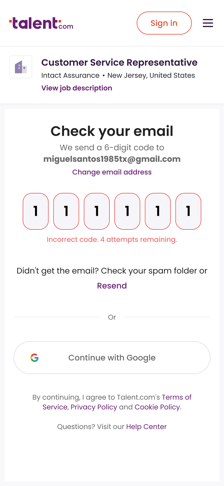
The funnel showed a large drop at OTP verification. Most of it wasn’t voluntary: the vast majority of users failed or were blocked by the step itself, with only a small share choosing to abandon. The PM and developer addressed the technical side (rate limiting and auto-fill) while I worked the UX changes.
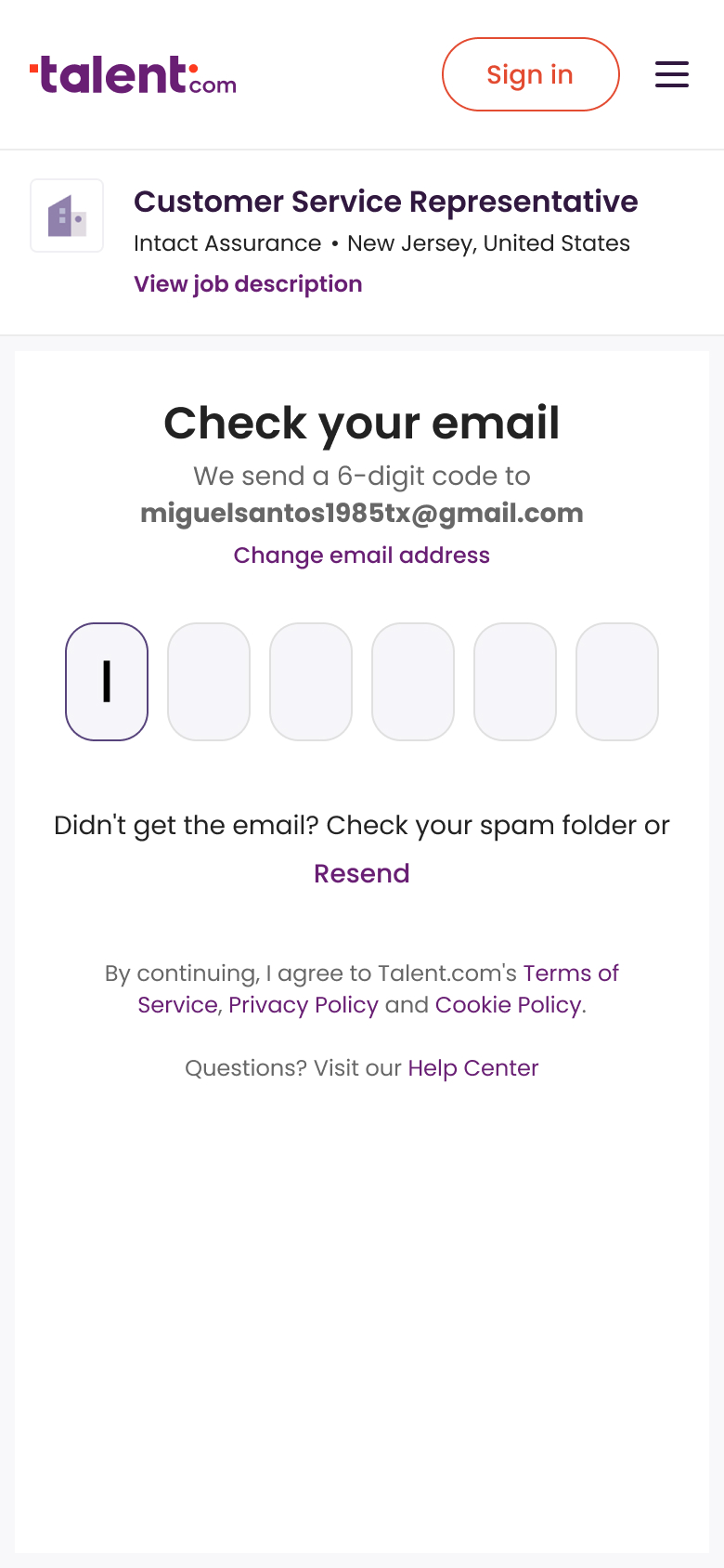
I changed the title from “Complete your application” to “Check your email” so the screen matched what users actually needed to do. I clarified recovery by adding a change email address action, added explicit troubleshooting guidance (check spam folder), and resurfaced Google SSO as an alternative path when verification failed.
I also removed the step tracker from the OTP screen. OTP is part of authentication, not the application, and the original tracker made this worse by quietly dropping one step once OTP was complete, leaving users with a lower count than when they started.
Before
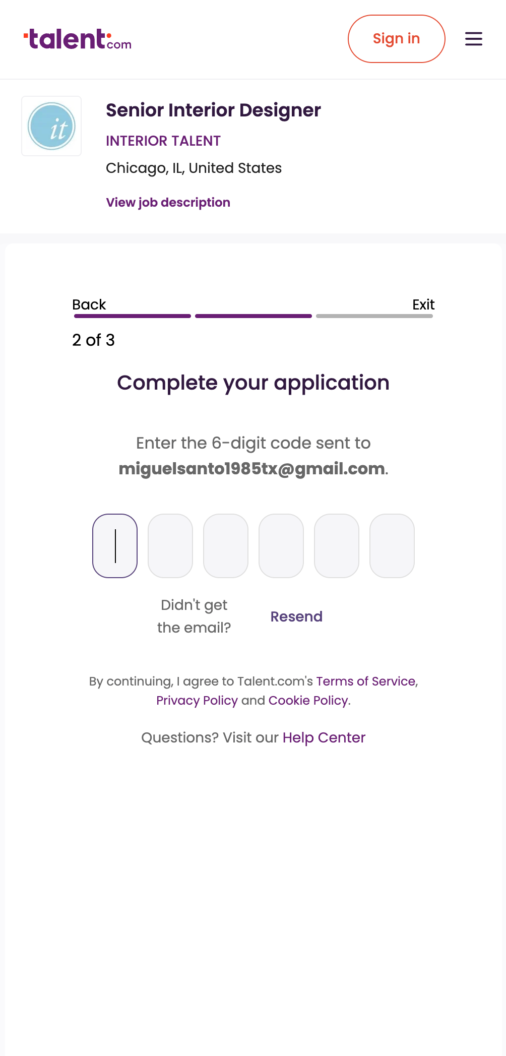
After
After
Redesigning the Review Step for Completion
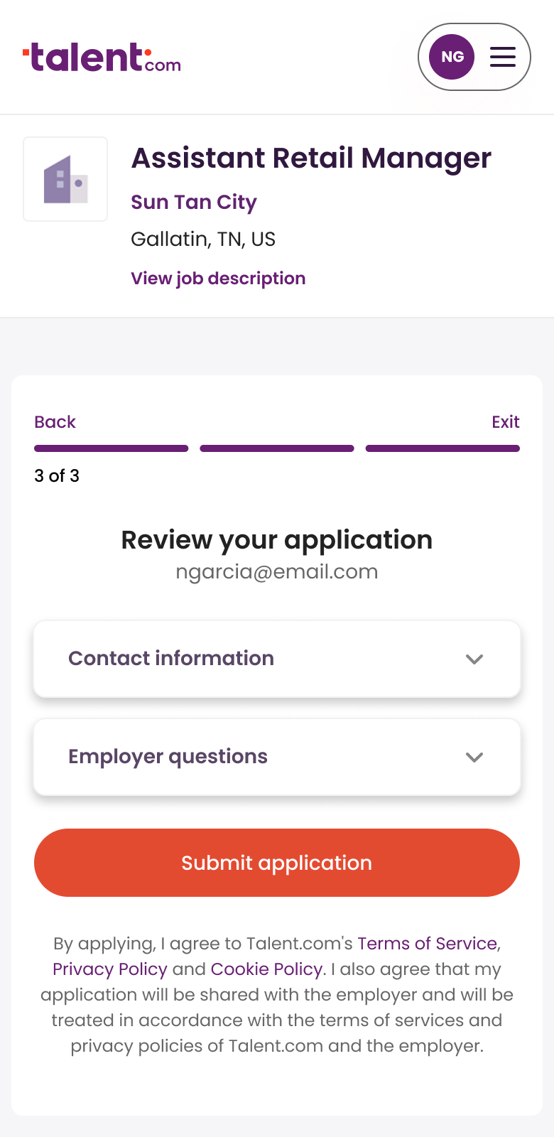
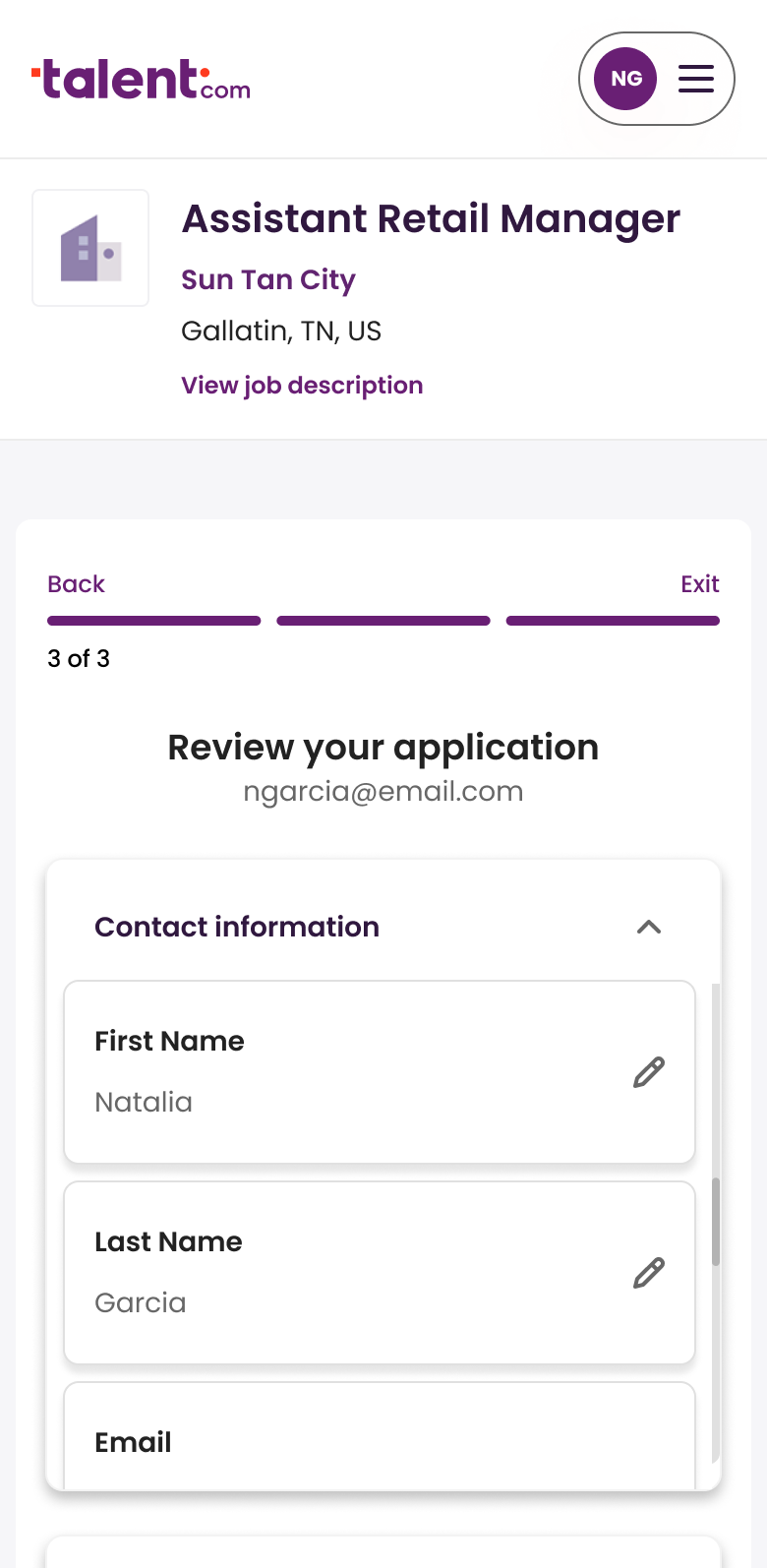
Review-to-submit had a real drop overall, and it was worse on mobile than desktop. By that point, users had already done the work, which made this a costly place to lose them. The title “Review your application” plus the email address read like a confirmation receipt, not a final checkpoint. Collapsed accordions hid information and edit options. On mobile, the header pushed the submit button out of view entirely.
Making the action unmistakable
I changed the title to “Review and send application” and the CTA to “Send application” to frame the screen as something to complete, not confirm. The email address became a post-submission warning. I stripped the accordions so answers were immediately visible, and added a sticky CTA so submit stayed in reach as the page grew longer. I also reduced the job header, a change affecting all steps of the application flow.
Before
Before
After
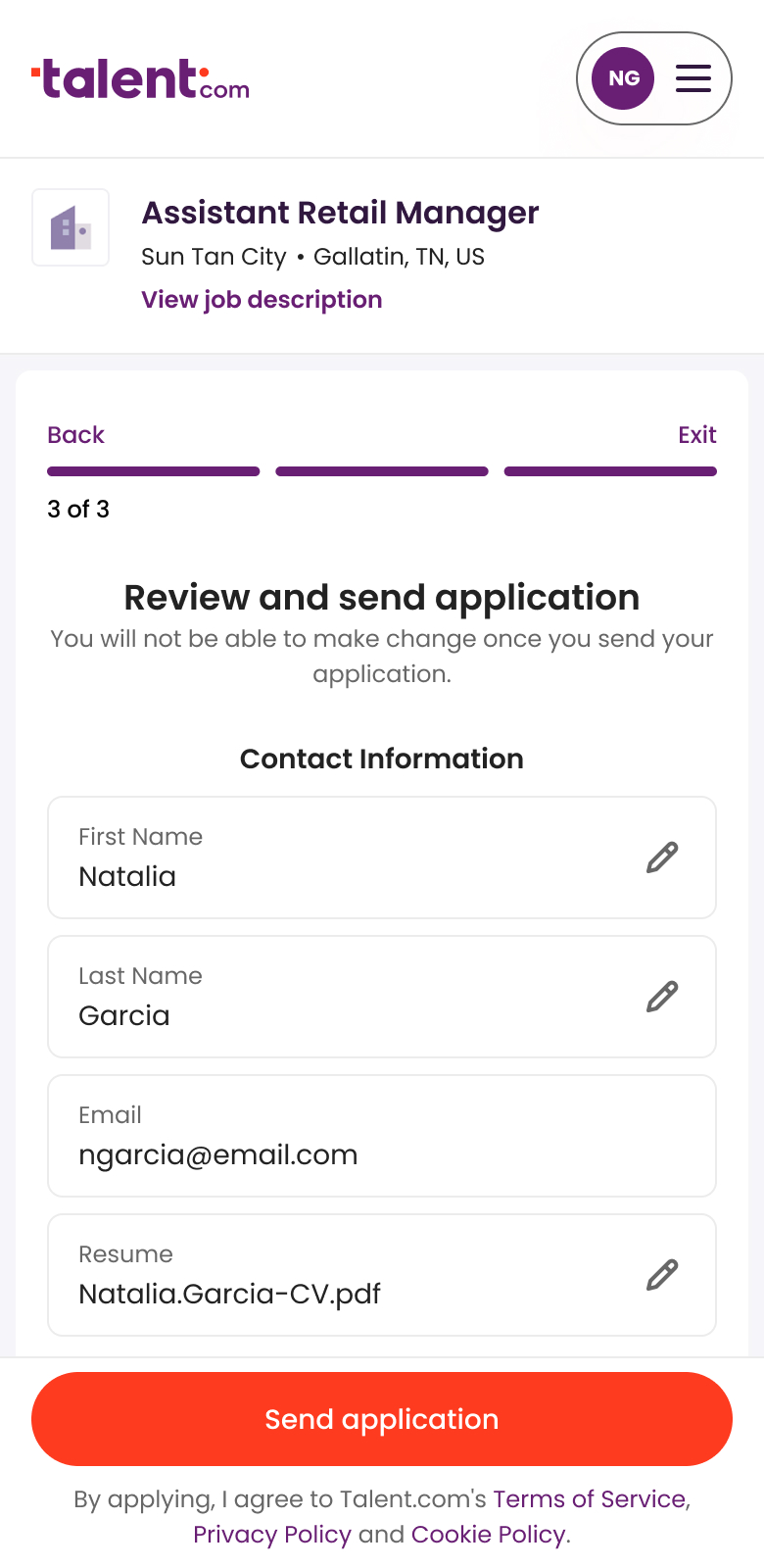
My initial MVP was more conservative. I planned to keep the accordion pattern and expand all sections by default so answers and edit options were visible. But once the developer and I started simplifying the interaction by removing nested scrolling and stripping out shadows, one continuous review surface became the cleaner, lower-effort solution.
Surfacing the security check
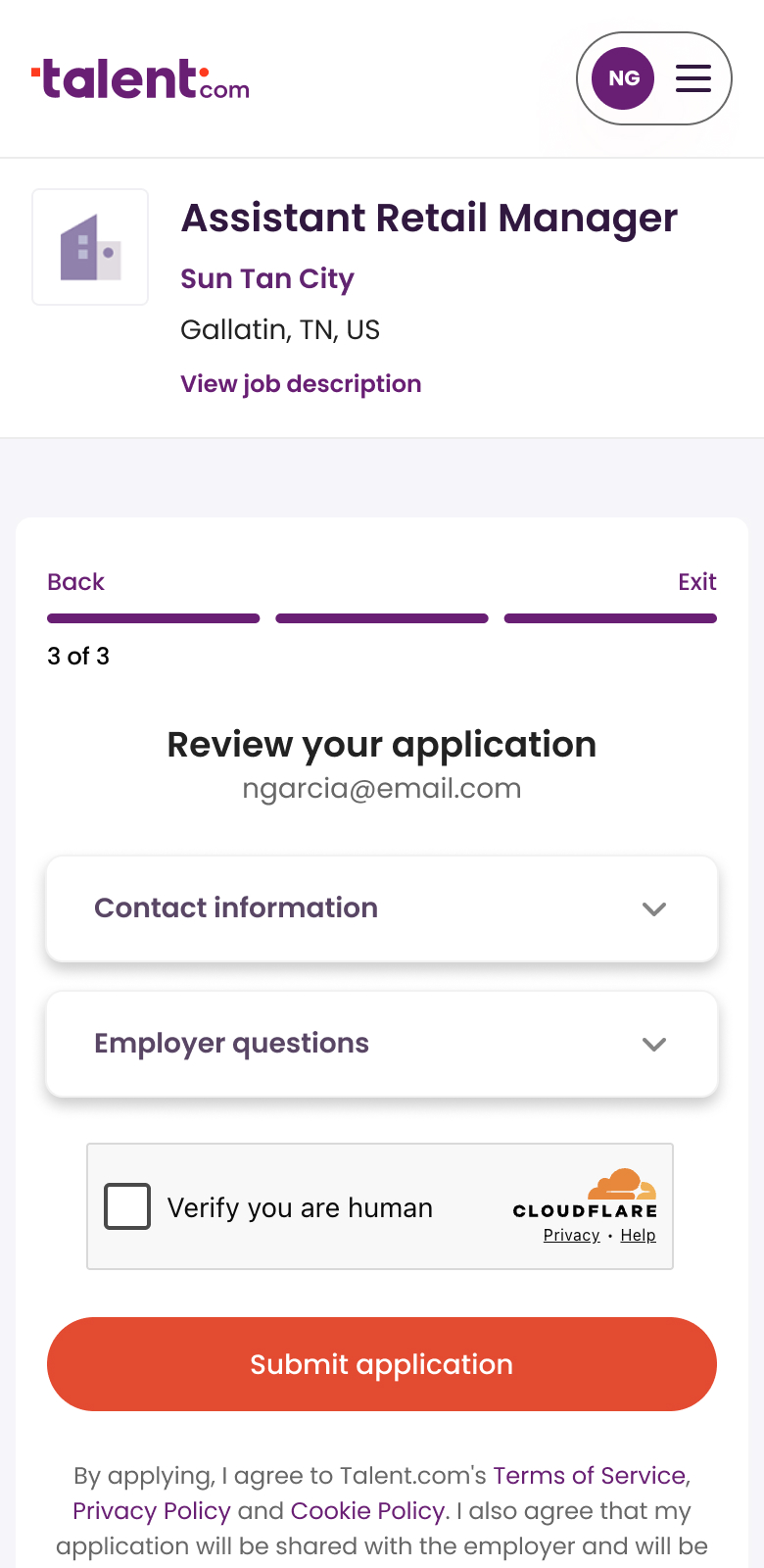
The security check didn’t appear for everyone, but when it did, the CTA was disabled until it was completed. The problem was that the check sat at the bottom of the page, below the button. Users had no way of knowing what was blocking them until they scrolled past the action they were trying to take. I moved the security check above the CTA so the dependency was visible and the disabled state made sense.
Before
After

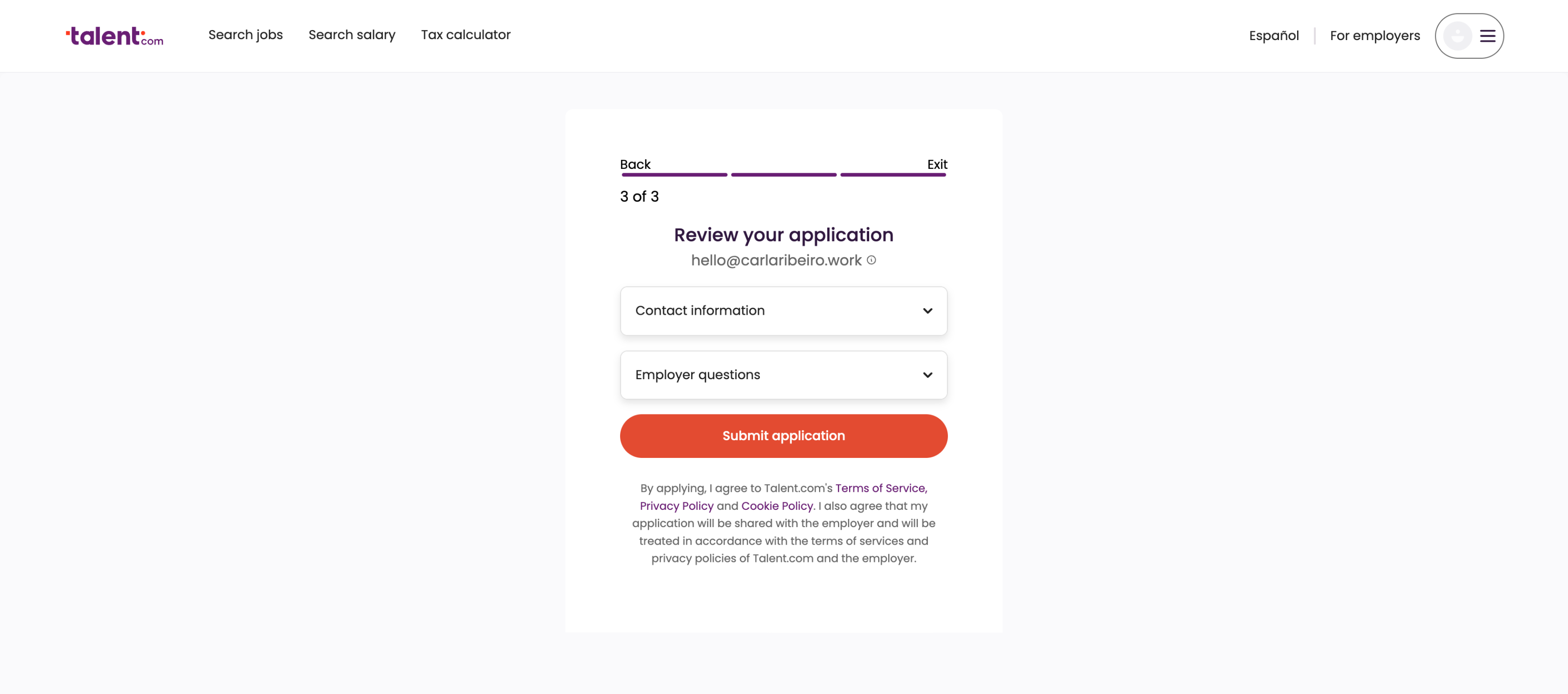
Applying the same fixes to desktop
Before
After

In a planning session, the data engineer flagged that the review step sample was too small for a clean A/B test, and reaching statistical significance would take too long. The PM couldn’t wait that long, so the squad decided together to ship the changes and monitor conversion directly rather than wait for a test environment that would never give clean signal.
After the redesign shipped, review-step completion improved from 75% to 92%, confirming that the drop was an interface problem, not an intent one.
Impact
Before the project started, a large share of applications were bot-driven, which meant conversion metrics and employer data were heavily inflated. The 30% lift in completed applications reflects a cleaner funnel: more real candidates reaching employers, not just more submissions. Overall conversion grew from 7.7% to 11%, despite the login wall, and for the first time, we had confidence in the numbers.
The individual wins were traceable. The review redesign moved completion from 75% to 92%.
Looking back
The project brought funnel instrumentation up to spec, meaning any future initiative on this flow could be properly scoped, tracked, and validated from the start. It also changed how we worked. We got better at distinguishing when something needed a test and when it just needed to ship. And we stopped waiting for a clean experiment environment to make decisions we already had enough signal for.
Two pieces of follow-up work were ready but never shipped: a one-step apply flow for authenticated users on jobs without screening questions, and required-field visibility so errors surfaced before submission instead of after. Both had designs ready to go. Neither made it past prioritization before I left the team.

Other Case Studies