06Revenue optimization
Making Related Jobs discoverable
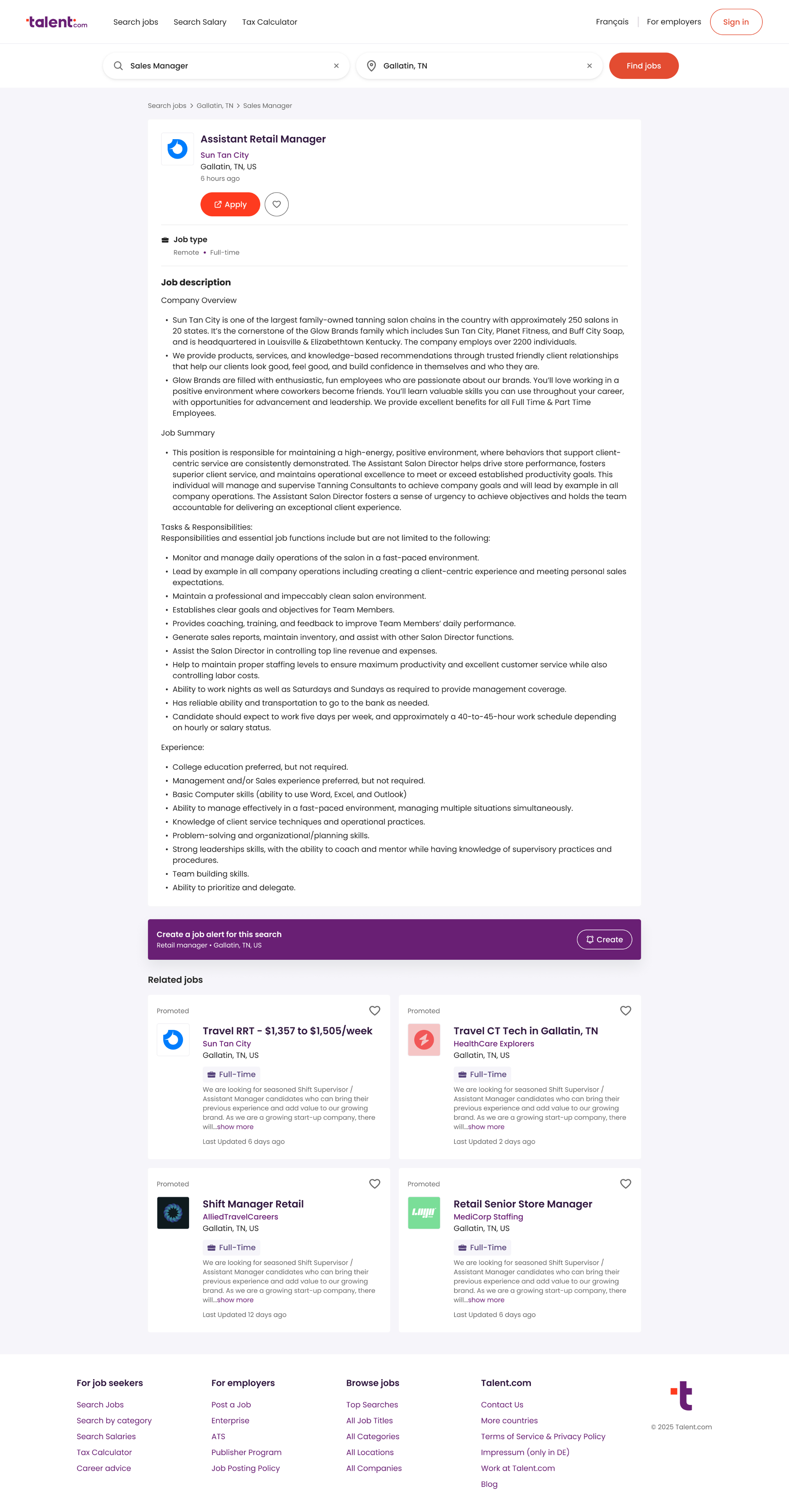
Jobseekers on Talent.com who didn't connect with a listing were just leaving: related jobs were buried below the fold, and fewer than 10% of users ever scrolled far enough to see them, suppressing clicks and limiting sponsored job performance.
As the lead designer on a small team with a PM and an engineer, I designed and sequenced a series of A/B experiments, starting with surfacing related jobs above the fold, then working through the click-routing and interaction problems holding performance back. The design challenge was making recommendations visible without competing with the primary apply action.
This was my first time working with A/B tests, and having a direct line from design decisions to revenue was energizing after years where that connection was hard to make.
Some details in this case study have been omitted to protect confidential information under an NDA. The scope and impact of the work are accurately represented.
Impact at a Glance
~5×
Monthly revenue from this feature
+40%
CTR on Related Jobs
Stable
Apply and signup rates
Carla brought Recommended Job Cards above the fold and maximized both user intent and revenue. Her redesign contributed to the highest revenue this feature has generated in over a year.
Constraints
The scope was deliberately narrow: the job description page itself was off-limits, and I could only make minor changes to the job card component. Any change that hurt apply or signup rates would be a non-starter, regardless of engagement gains. The design challenge was finding ways to improve discoverability within those constraints, without making related jobs compete with the primary action. Job matching logic (which jobs surfaced as related) was owned by a separate team and not something we could experiment with.
Desktop: Moving Related Jobs Above the Fold
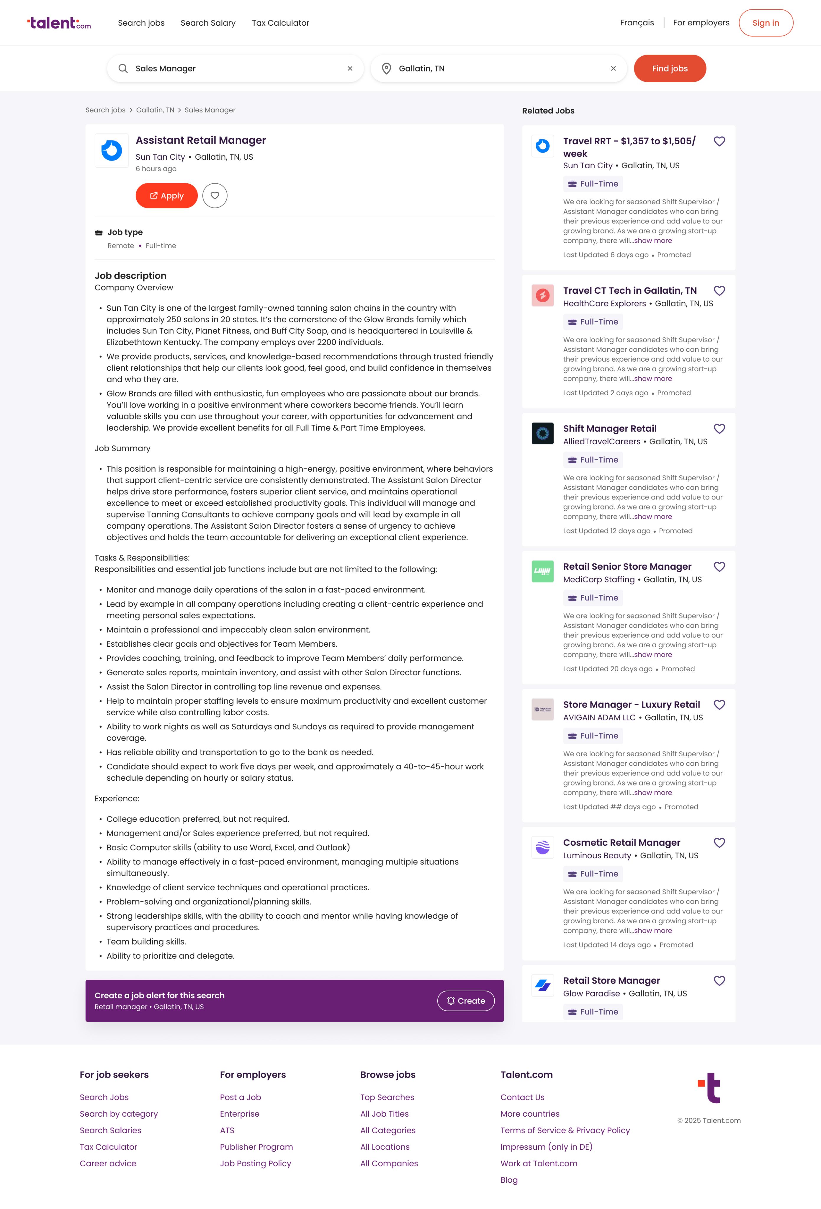
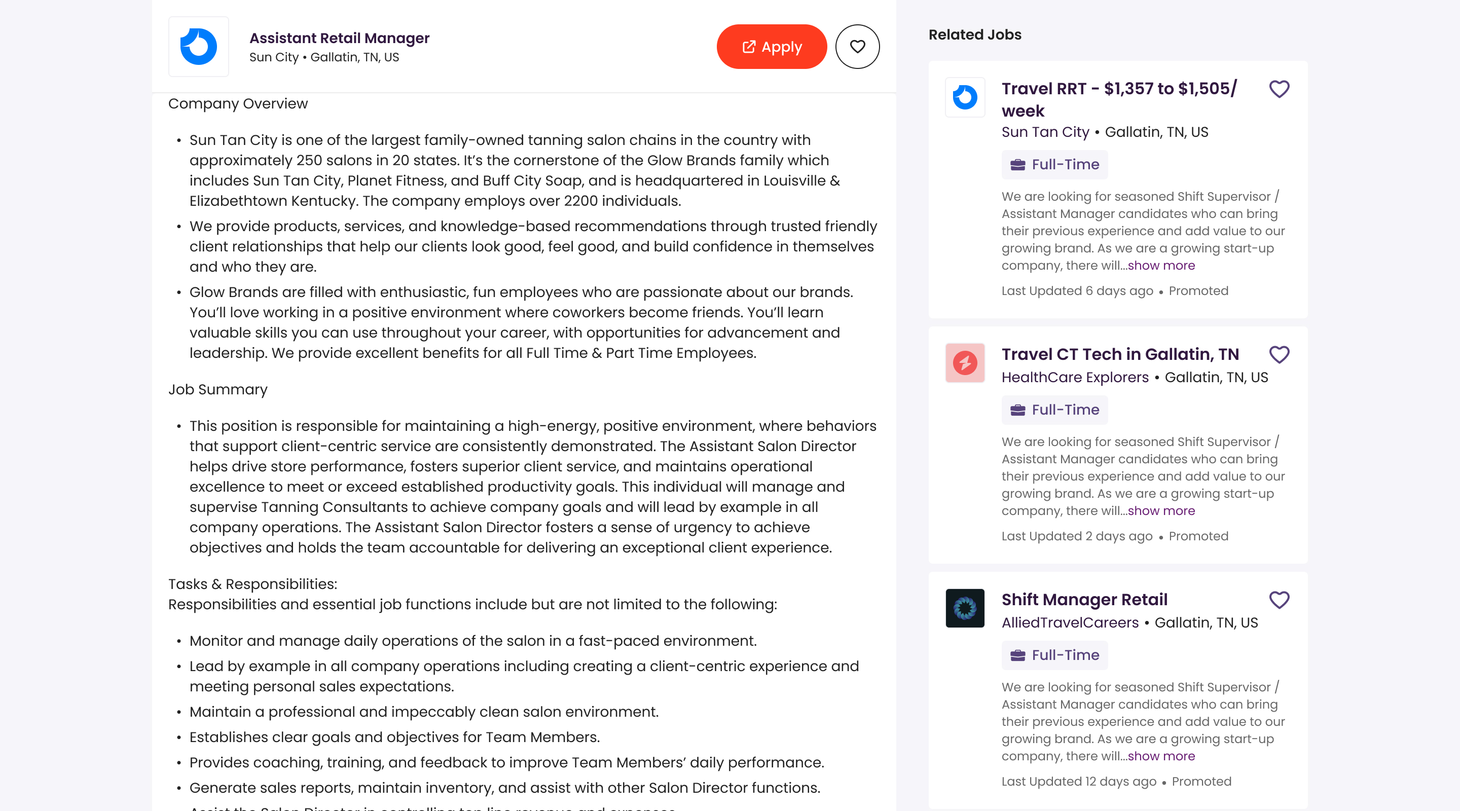
I moved related jobs to a side column, letting users evaluate the job description and alternatives in parallel. The sidebar felt like the obvious solution to me, but the PM was hesitant. A previous designer had advised against it, worried it would distract jobseekers from evaluating the role they came to see. Since this was an A/B test and the worst outcome was reverting, I convinced the PM to move forward.
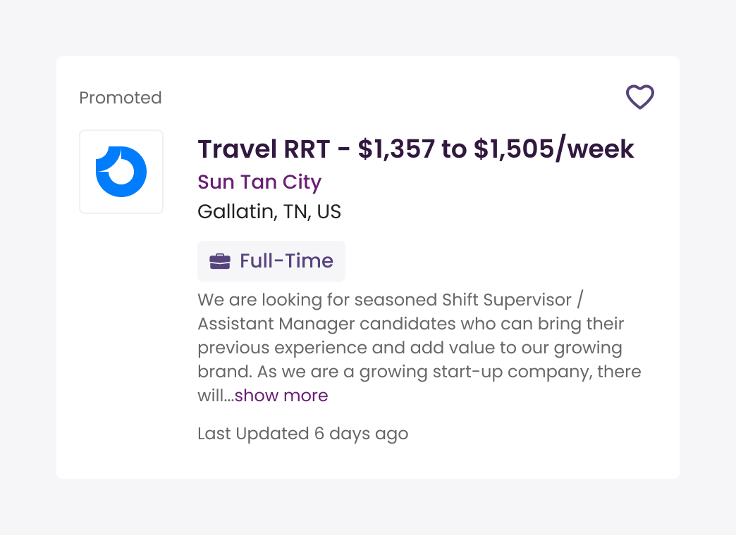
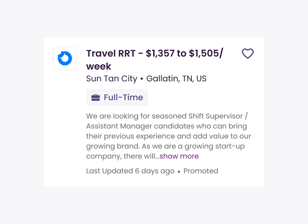
To avoid the sidebar competing visually with the main content, I reduced the weight of each card. The avatar got smaller, the location moved after the company name, and the ‘Promoted’ label was repositioned. Small changes that made the cards feel like supporting information rather than a second focus point.
Before
After
Before
After
Keeping the Apply Button in Reach
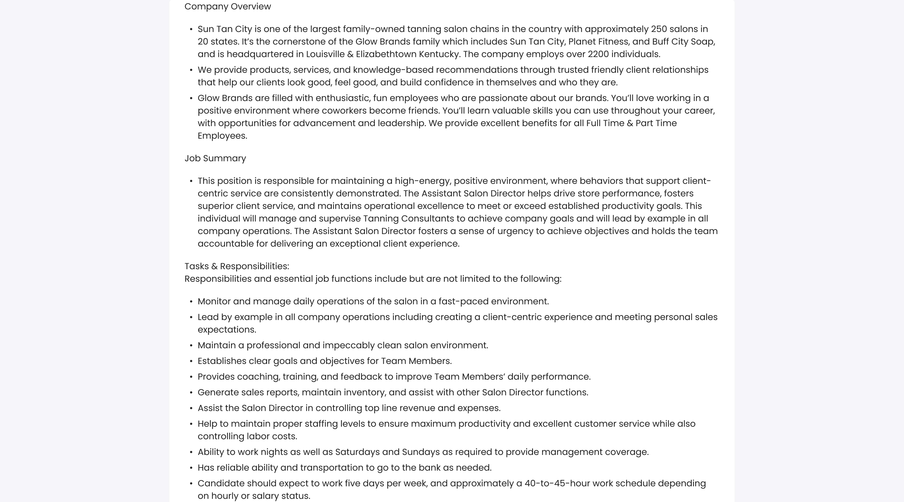
I added independent scroll to each column, so users could browse related jobs without losing their place in the job description and vice versa. I also moved the primary actions into a sticky header, so the apply button stayed visible regardless of where users were on the page.
Before
After
Mobile: Making Related Jobs Findable
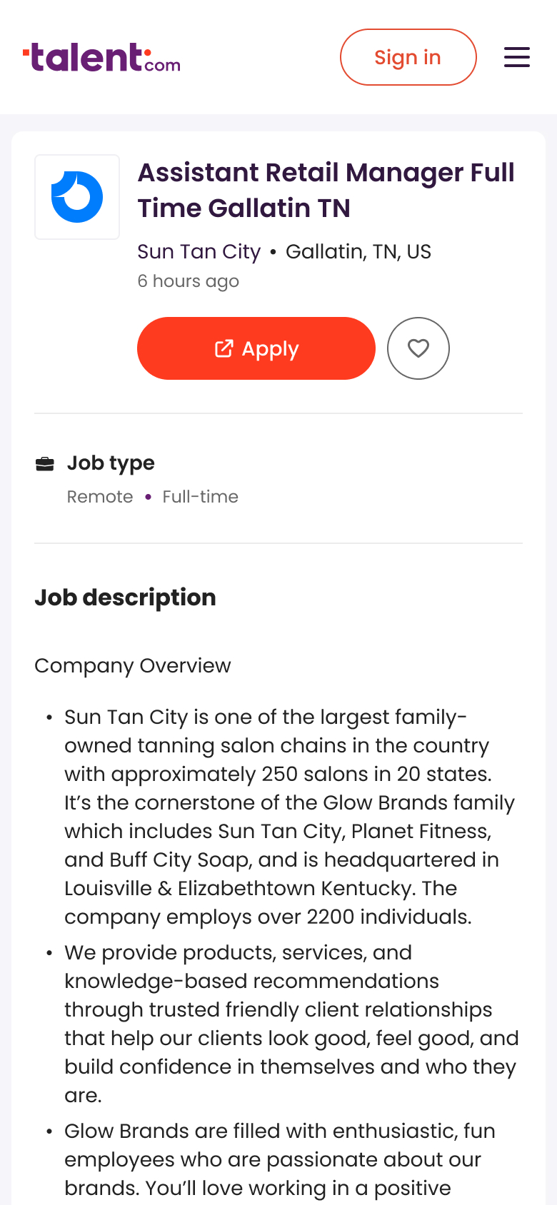
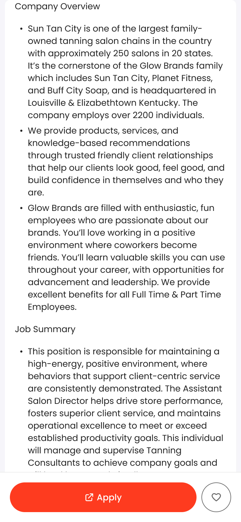
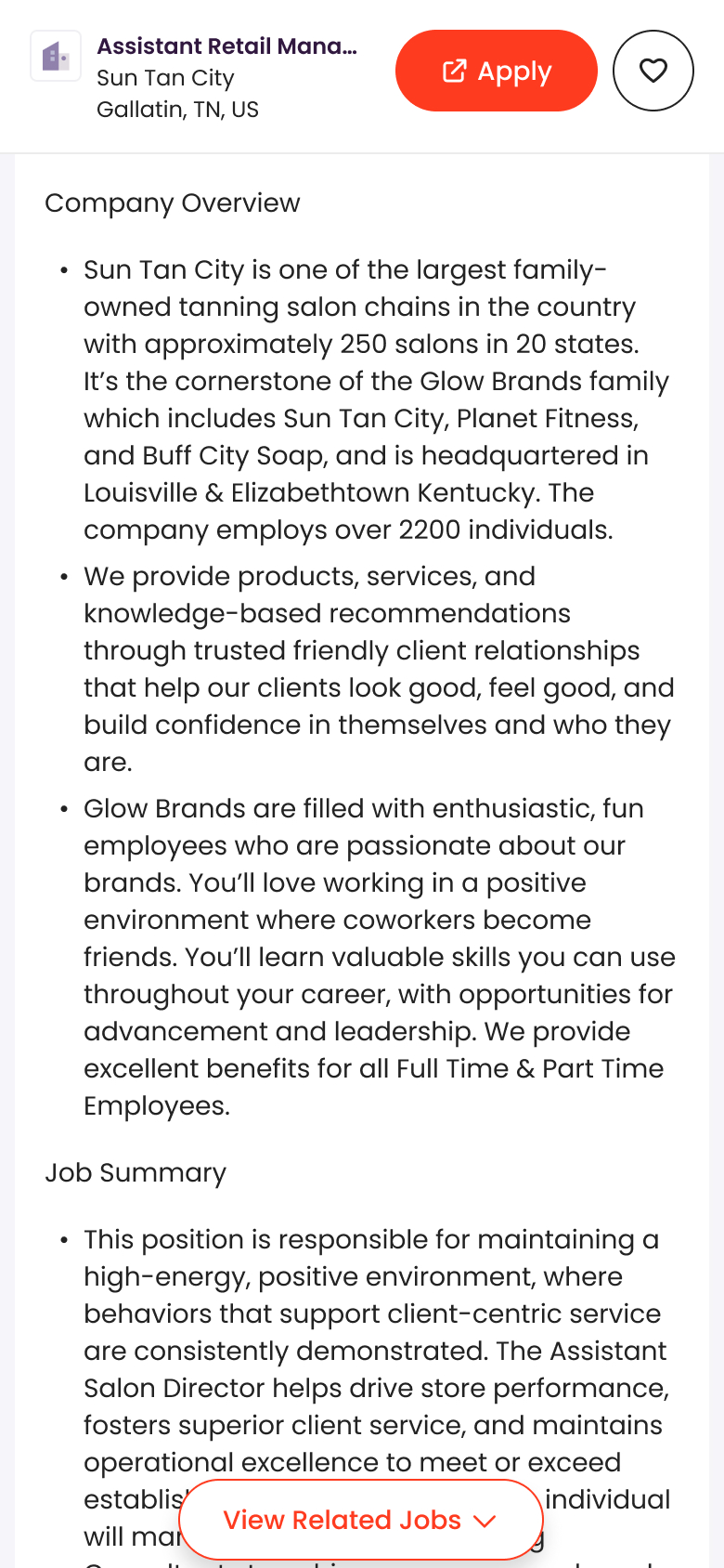
Mobile was the harder problem as limited screen real estate made competing actions especially risky. I introduced an explicit ‘View related jobs’ button that let jobseekers know there were more jobs without disrupting their evaluation of the current role. The button auto-scrolled the page down to the related jobs section when tapped.
Before
After

Clearing Space for the Trigger
Before, a sticky footer with the apply button appeared as you scrolled down the job description. I needed the bottom of the screen free for the ‘View related jobs’ trigger, so I moved the primary actions into a new sticky header. It also included the job title, company, and location, mirroring the sticky header approach used on desktop.
Before
After
Fixing Where Clicks Were Landing
Before, all Related Jobs clicks routed to another Talent.com job description page, even for sponsored jobs where the employer required the application to happen on their site. The extra step added friction and delayed the apply flow, so I worked with the PM to map out the ideal routing by job type, balancing user experience and business goals. The only change was for sponsored jobs with external apply flows: those would now open in a new tab instead of routing through a Talent.com page first.
The new tab preserved their place on Talent.com, so they could come back and keep browsing after applying. This change drove a +300% relative increase in net-billed revenue from related jobs, because clicks were now reaching their intended destination.
When Engagement Hurts Signups
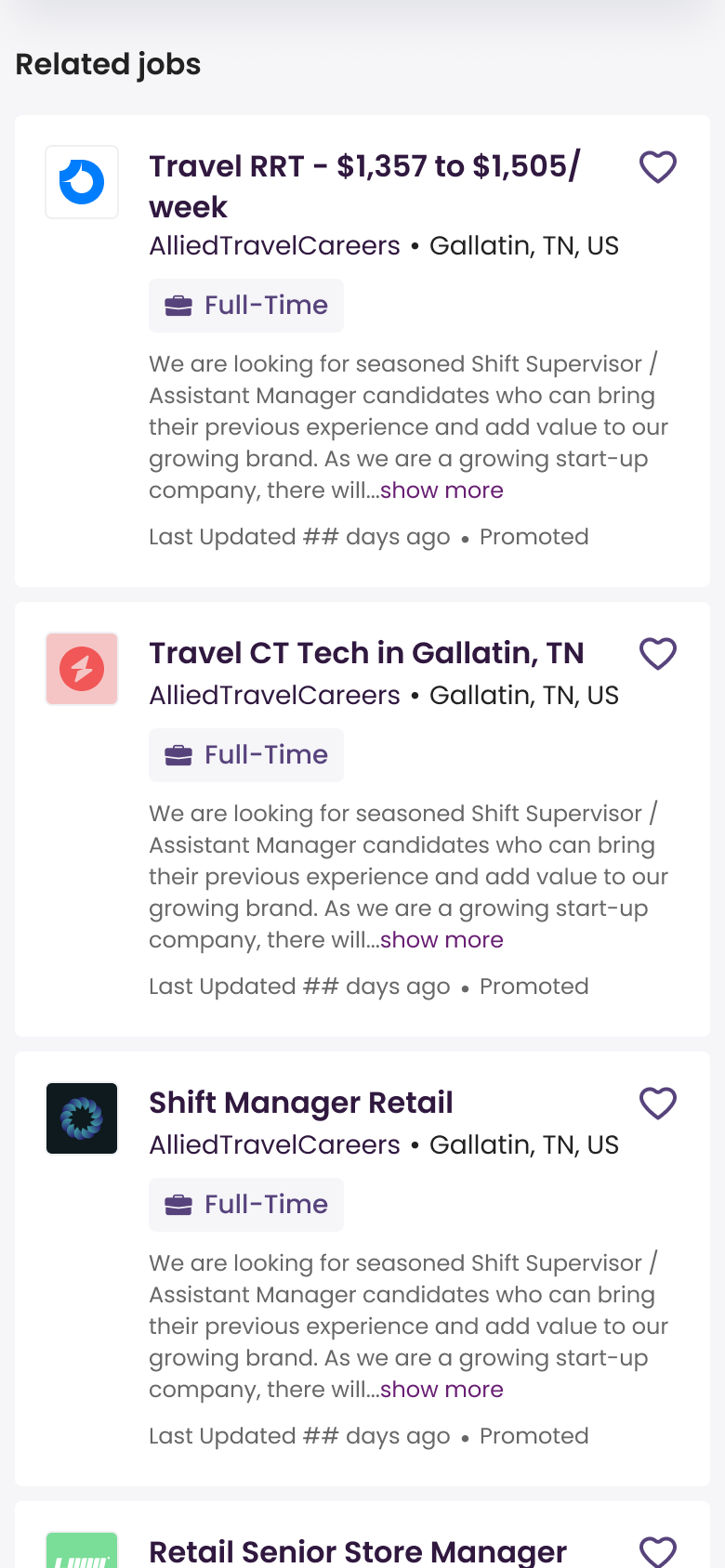
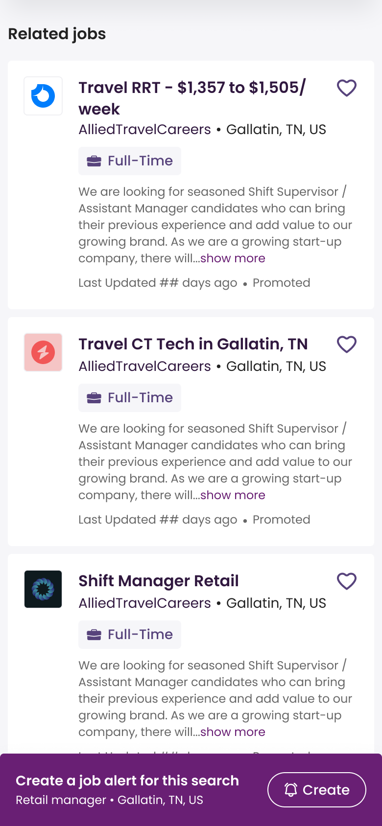
The experiment drove a ~40% increase in CTR and ~9% increase in related-jobs revenue. On mobile, though, there was a ~5% dip in signup rate. The job alert banner, one of the main signup entry points on the Job Description page, sits between the job description and the related jobs. Once users tapped “View related jobs,” they scrolled into the panel, bypassed the banner, and never saw it again.
To fix it, I made the job alert banner sticky as users browsed related jobs on mobile, keeping the signup path visible without touching the feature driving engagement. Signup rates stabilized, and the experiment scaled to a worldwide rollout.
Before
After
Impact
Related Jobs went from a buried module that fewer than 10% of jobseekers ever saw to a feature they were actively using to explore alternatives and find roles worth applying to. Placement and redirect logic each contributed distinct, measurable lifts. Monthly revenue from the feature grew roughly 5×, because more users were reaching jobs that matched their intent.
Looking back
This was my first time working within a rigorous A/B testing process. The experiment design, rollout, and measurement were led by people with a lot more experience in that space. I contributed the design ideas and observed how they turned out. What I took from it was how much a controlled test changes what you’re willing to try. Because we could catch a problem early, I was willing to take a bet I’d otherwise have been too cautious about.
Other Case Studies